Monday, August 24, 2009

The cat's outta the bag - there's a bun in the oven!

Yes friends it's true - I'm pregnant. (again) What else can keep a woman with too much to say away from her own blog for the entire summer? Can you say morning sickness followed by maniacal bagels-on-the-couch cravings and daily naps that feel completely indulgent but also totally necessary? So I'm over the hump, I've got a bump - not just a beer-belly-look alike (god's cruel joke for early pregnancy) and ready to roll. We found out we're having another boy so my next design project is my son-to-be's nursery. Hot off a week at the beach where I waddled after my first-born, a dare-deviling 19-month 0ld, I am inspired by the ocean and the serenity of the waves and water. So an underwater oasis it will be. Which brings me to my design mention for this post - have you all tried etsy.com yet? Really? Have you not? Come on folks. It's AMAZING. It is is ebay's much cooler, more creative cousin, only you don't bid. Actually take craig's list, if the only thing that craig allowed on the list were really cool, creatively collected or handmade items that you would never find anywhere else, made by creative peeps all over the world. It rocks. In my process for developing my underwater nursery I searched for stuff on etsy and found almost everything I need for a very cool, inspiring ocean-mod spot for my new tot. And although everything is available in baby boy blue, it's also available in a range of other colors - on my mind of late inspired by a week at the beach - creamsickle orange a la Kohr's icecream, heather grey skies, merlot I couldn't drink, seaweed green draped over my son's knees as he sat in the sand. I want to mix it up a bit - there is much much more than just baby blue.


That and a trip to Fawn & Forest and I'll be set. I just found this beautifully simple upholstered rocking chair monte alto rocke
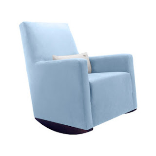
r by monte - (mama needs cushioning for those long nursing nights - no more rock hard rockers on my bum!) on F&F, my absolute favorite, most rocking online baby emporium, run by a super-cool creative mama named Summer.


That and Natura paint by Benjamin Moore - what I think (not 100% sure) but I think is the best no-VOC paint on the market. I'm doing a test case...what I like is that the colorant process - adding the color to the white base does not add VOC's and you get to choose from the original BM catalogue - you don't have to limit yourself to fewer colors for those of us who love to know ALL the options - and you don't have to shlep another chip wheel. How great is that?


Friday, June 12, 2009

Designers-turned-parents rock my world

Especially when said designers continue to design fabulous things for babies and kids, without compromising of what's important to eco-conscious parents - while certainly answering the needs of children in a playful, spirited way. I just wrote a piece for Dwell on Design about some of my favorite mommy+daddy designer stories....it looks like I'll be shopping for their wares soon enough, as the stork is expected again in December in our house!

Tuesday, March 31, 2009

RECESSION RENOVATIONS 1st EDITION


It's time to get real people. If I had a dime for every client that has told me in the past three months that they had less money to spend on their home than originally anticipated, I'd be a rich lady. Good news for me - lots of clients - good news for me - they have less money to spend. Why is it good news for me? Because I can finally unleash my inner cheap bastard without shame. I am the frugalest fanny you know. Despite being given the beautiful opportunity to work in the world of television and live within spitting distance of the most expensive city on the planet, I am super cheap. But it's not like cheap for cheap's sake. It's the why-pay-retail attitude. But it's more like this - why pay more, when what I really want is a creative and dynamic space that is personal and beautiful and one that I am personally taking part in buildling? This series, entitled recession renovations, is going to feature and focus on just that - creating personal, beautiful, dynamic spaces that are recession-ready. The ideas are not just choosing a cheaper way to do the same old thing - they are about doing something new and innovative and fabulous, on the cheap. Yay. I've had this bottled up way too long.


Remember stickers in the sixth grade? First object of recession-renovation obsession: SmartTiles. These babies are the kind of tromp d'oeil of your dreams - tricks the eye in a clean, streamlined way, without the fussy faux finishing b.s. They are made of vinyl, but, no kidding, you'd swear they were made of glass. (see photos above)
They mimic the feel and texture and look of porcelain or glass tile, but they are a self-sticking vinyl applique for your walls. This your kitchen bling on a budget. This is the backsplash that got slashed because you decided you were $2000 short. This is the answer to making your bathroom creative and personal. Tile work, as you might now, is incredible labor intensive - when done properly. Sure, it's a DIY for some, but it shouldn't be attempted unless you have an attention to detail, can work quickly and neatly, and you don't mind making mistakes and living with it - as in, living with a mistake in concrete - for the foreseeable future. SmartTiles sort of let you have the look, feel and function of tile without the tile contractor. Have him do something else. This you can do if you can use scissors and a ruler. They come in a splendid array of colors and textures - mostly modern - and they are available at HomeDepot.com - partial catalogue. This is a fabby Canadien company from Montreal. They swear by the durability and lasting function of these tiles which work well in wet spaces like kitchens and bathrooms. So while they are not cheap materials, they are a project where you only pay for materials - no labor, saving lots of dough in the process.

Tuesday, March 24, 2009

POWERHOUSE


I love this story. And here it is in the Times. And here is their website. Sometimes only artists will do when there is trouble and in Detroit there is plenty of it. Artistic urban renewal, yahoo!

Tuesday, February 24, 2009

From the Market - Ebony + Ivory Baby


Guys, my plans to write from the road whilst in Vegas evaporated in the desert air and in the realization that ensuring my son didn't break anything in our room at the Palazzo would take nearly all my time and focus, aside from the time I was speaking at World Market on the topic of fabulous nursery design. So only now, weeks afterwards, am I digesting the bags of "loot" - oddles of business cards, glossy collateral from green companies (irony anyone) and samples galore. The largest trend that seemed to cross all 16 floors and three buildlings (have you been to World Market in Vegas - you need a map and a GPS) is black and white. Negative + positive space. Uber-contrast. Light/Dark. However you want to express it - the polar extremes in color dominated the showrooms. Some were divided - completely black on one side - completely white on the other. There were also gobs of historical contrast - mid-century nuzzling up to french provincial - lots of contemporary + baroque doing the tango. Some of it worked and some of it didn't -here are some of my faves: Noir Furniture. Out of Los Angeles, their website is all black and white and sort of sad, but their furniture rocks. This is a company whose whole line seems to be predicated on contrast and playing with scale. I love the chairs and tables that look at once inviting and like they will hurt you if you touch them. I love their dome chair - a look I saw elsewhere - but not in white-washed mahogany and such playfulnes reminisicent of Alice in Wonderland if she had a place upstate as it is from Noir. See above. More tomorrow....

Monday, February 9, 2009

Whatever Happens at World Market Stays at World Market

I'm leaving tomorrow for World Market, a global home design + furnishings trade show in Las Vegas. They actually erect a small city for this show. You've never seen so many pretty things in your life. I'm speaking on the topic of Fabulous Nurseries and Kids' Rooms. Yippee. I'm sure I'll have fun things to post while there, with family in tow.

Friday, January 23, 2009

Rockin' rocker: Nursing Rhymes


When I was pregnant I was told to purchase a glider, which is basically the love-child of a club chair and and laz-y boy. Maybe a bloated rocking chair on it's best day. Waddling around my big box baby store, I couldn't stomach it. Both too ugly, bulky, pastel-y and matronly, if furniture can read as such, both my design sense and my one-bedroom-apartment told me no. The This Old House'er in me martyr-nursed in an old rocking chair with the charm of an upstate farm house and the comfort of a pitch-fork. My husband loved to tell me how chic and rustic it looked with five pillows on it. Ugly gliders aren't good news for the design-preferenced nursing mother. Let me tell you - you log a lot of hours sitting, nursing, holding that baby and there is a real need for a comfortable, soft, roomy place for all of the above. And when you're not sitting in it you're likely looking at it - peripherally, but logging hours around it nonetheless changing diapers, folding tiny pants, etc. As my son turns 13 months old, I still find myself parking it in the rocking chair sometimes three times a day for story time and nap time. I think there simply must be a better option....You have your refusal to compromise ideals for safety, President Obama, I reject the notion that I have to surrender to something ugly to take care of my child in comfort.

Modern nursery designers have been sprouting daily it seems - across all price points and I'm thrilled. Often family-inspired entrepreneurs who are bringing really beautiful streamlined pieces to market. I am going to go out on a limb and say that the glider is not really the piece to go for clean lines. We need soft and nurturing, womb-like here. Not stark. Not stripped down to essentials, devoid of ornamentation. We need a little extra on the arms to hold that baby, a little extra in the tush. Thank goodness good design solves all. As a nonconvetional modern exception, the egg chair, although wholly unconventional is great example of clean lines, extended, to be comodious and although I haven't tried it as a nursing chair - next time I will. The real winner in my book however is the Empire Rocker from NurseryWorks. Oh my goodness. Ok, I admit it - I am a sucker for modern references to traditional furniture. But it happens to be one of the most comfortable chairs I've ever sat in. The Empire Rocker is a wink and a nod to an old tufted smoking chair, which was ironically neither intended for a woman, nor to be comfortable - but this version is - both comfortable and intended for nursing, reading, night-nuzzling and all the other delights of bedtime. And the ultimate sniff test: I'd put this in my living room -it doesn't read nursery or kids room, in rich eggplant-hued velvet - score one for nursing moms driving design!

Saturday, January 17, 2009

Mid-Winter's Resolution - Double Duty

How can it be almost February? I am just getting to my New Year's resolutions. One was to get the job to design the Obama White House (see below). I did not get the job, and so my list is now back to what it was before - work out more, be nicer to my husband, buy things with double duty.

To explain...I was recently inspired by an NPR story on design - the whole notion of democratic design, actually, and the fact the people are asking for better design, and for things to do more than just sit there. Perhaps Obama will get credit for this too, as a movement of sorts - regardless, I am game. So, with that, I got inspired to get on my own soap box about the notion of double duty design. Don’t buy anything unless it makes you rich or thin.

OK, OK, a bit of an new year’s inspired hyperbole, along the lines of “wake up every day at 5am and workout” – but you get the point. Don’t buy something unless it serves at least two purposes. This goes for furniture, accessories, objets, etc. This is now abundantly possible. Whether space is a constraint or not – this is just good design for the home. Living in Manhattan was like double-duty boot camp for this kind of procurement. For something to occupy space in my one-bedroom apartment, large as it was, it had to offer two uses, be attractive in the middle of a room, or backed into a corner, and I had to absolutely love it. If not, I’d have been swallowed by my lovely oversized, singular-function pieces – like my antique sewing machine. I certainly loved it – but it had all the function of a grain of rice with my name etched onto it.

The story on NPR discussed double-duty design as a significant trend in industrial and furniture design as well as architecture. Of course this annoys me just a tad because it’s not a new concept, and emerged through the arts and crafts movement mot likely, but now it is likely reactionary to people having to flee in droves from their real or idealized McMansions as a function of the economy. People have not the option to up and leave their starter house rancher anymore for a variety of reasons – smaller and better has to work. By the way, I am right their with you.

A few ideas for you on this one. Naturally I am coming to this from the parental vantage point. When I think about furniture, I am thinking about what it can do now that my son is 12 month old– hopefully more than one thing -- but also what can it do in a few months or years – that’s another way to get your second duty. (Sounds awful – but you get my point.) The Expedit Bookcase from Ikea functions one way laterally – on the floor – it makes a great open toddler-height book and toy storage, as well as a reading bench for younger children. I can sit on it, but I worry about it holding my weight – and that’s not because I’m not in my skinny jeans again yet. Vertically, it makes great, slender storage for an entry way, laundry room, or just about anywhere you need or want variable height, attractive, open shelving. You can also make a trifecta – two verticals, one horizontal for a book nook for a child’s room. And it can also make a great coffee table in the middle of the room. Speaking of alternative coffee tables - when did they get so big and out of control? It's a coffee table, not a buffet people! Anyway, in thinking about slender, space efficient ways to have your coffee in front of your tv...I am a big fan of benches for small living rooms – they can function as coffee tables –and sometimes – slender as they are – they function better than traditional coffee tables. Some even have support "beams" across the spanning across the legs which are great for storing magazines, or books. The small surface area means you are unlikely to use a bench-as-coffee table arrangement as a repository for crap. I like this Asian-inspired bench from Overstock.com. And when additional people are in your space (if you are one of the lucky ones to have a social life - what was that like again?) then the coffee table becomes additional seating, and it makes scarce more easily than a coffee table when you want to open the room up.