So, you're not really supposed to move, change jobs, have a baby, and undertake a major house renovation at the same time.
But I don't really live by the What You're Supposed to Do Handbook. So that's exactly what I'm doing. I'm moving back to the Washington, DC area, where my husband and I met. My husband is changing jobs, and I'm having another baby, our third. And, arguably as hard as giving birth - we're going to renovate the house we're about to move into.
We're movin into a house we know well - we've owned it for ten years and lived in it before we had kids. Now it needs to work for three additional little people, and for my ever changing and morphing design sensibilities. I've gone through a big modern phase in my New York apartment chapter, and now I will merge all that accumulated urbaneness with the cottage sensibility appropriate for my little new old house.
And try to keep it all together with my two little boys who are somewhere in between being too young too trully help and just young enough to make every task that much more difficult or messy.
Should be interesting.
I'll keep ya posted.
Wednesday, June 1, 2011

Friday, May 6, 2011
Grandma on my mind
 grandma & lukie, august 2010

My grandmother is 93. She recently broke her hip. As she's been in the hospital, I keep thinking how unhappy she must be not to be home. I don't that she misses the small condo she shares with my grandfather now that they are in their 90s, but I imagine she misses HER home - the olive-green cape she created to raise her family, the one she decorated vigilantly, and filled with her handicraft. I've been day dreaming about all the time I spent in her house growing up, with a lot of design nostalgia.
Her home was filled with braided rugs and flowery china pieces. Lots of floral chints curtains, handmade afgans, colored glass lamps not necessarily from Tiffany and friendly little figurines (everywhere) which, if they lacked in extravagance, they made up in homespun charm. She taught me that to have your own home was quite a priveledge, and you revel in that gift, especially as a woman, by making it as beautiful, interesting and clean (ugh, that part I learn begrudingly) as you can. These things remind me of her. Thanks etsy.
Thursday, April 14, 2011
Kill the deadly ache: Who are you?
"There is no ache more deadly than the striving to be oneself." -Yevgeniy Vinokurov We all know that pretending to be someone else is painful, not to mention exhausting. What about your house? Is it too, pretending? This is often much less sinister than it sounds - the truth is so many people are after a "look" or an "effect" or, perish the thought, spit-up-in-my-mouth, a "theme." It's plenty ok with me if you copy right out of the pile of catalogues that come in the mail or right out of House Beautiful, if you are genuinely inspired and moved by the design on these pages. That's right - let's get Biblical with our houses. Wait until you are moved by something before you buy it, nail it up or have someone install it. This means it will be a more lasting feature in your home. This is also are a really nice way to avoid buyer's remorse, so common in big house decisions! So put down the mags and cats for now. Take a moment. Knowing yourself and making your home reflect this is quite possibly the greatest thing on earth. This is coming from a house-addict, an abode-lover, a dedicated devotee to all things related to residential design, but still, who out there doesn't like to come home? And what is more home, than a space that makes you feel good, that reflects you, and knows you? That's why the best education you can get to make your home more beautiful, is an education in yourself. What makes you smile? blush? smirk? snark? What makes you think of that first love? What makes you angry? What makes you think of childhood in a good way? What makes you think of childhood like a briar patch? What do you need to relax? recharge? recluse? These are the questions you should be asking waaaaay before you pick up a color wheel or look at a design magazine. This is hard work. That's certainly true. And if you aren't that sensitive to your surroundings, if you are "never home" or if you swear you really "just don't care," I think you're lying, but you can probably skip the questions above all the same. For the rest of you out there with a pulse, put the work + time in, and stick to your guns. It's sometimes hard to pick the wild green chair that makes you swoon, that's a little weird, or the chartreuse kitchen walls, or the gigantic brass gorilla knocker on your front door. But have confidence - the only audience that matter is YOU and guess what? You're watching.
Tuesday, March 29, 2011
ironically, of course i'm very tired as I write this...
Interviewed again on the topic of baby sleep + the connection to interior design. (Which I believe is tremendous.) Enjoy - this time via Parents Magazine Online.
Wednesday, March 23, 2011
Mother's Little Helper: The well-designed nursery
Yes, it snowed today in Northern NJ. Really? 
Now that I got that out of my system, on to the intersection of sleep/design. I worked with Nicole Johnson, founder of the ever-popular Baby Sleep Site, on this one. She's the sleep whisperer, I will do almost anything to get some sleep in my house, including making sure every decoration in my children's rooms works on my side. I wrote a piece for her blog - check it out here.

Now that I got that out of my system, on to the intersection of sleep/design. I worked with Nicole Johnson, founder of the ever-popular Baby Sleep Site, on this one. She's the sleep whisperer, I will do almost anything to get some sleep in my house, including making sure every decoration in my children's rooms works on my side. I wrote a piece for her blog - check it out here.
Monday, March 7, 2011
it's all tranny nowadays: transitional 101

I am working with several families now in search of the perfect transitional kitchen space. Not to get existential about it - but a transitional kitchen is neither here, no there. It is in a mode that straddles modern, traditional and has license to cherry pick from either side to achieve a balance that makes it impossible to really label it in any other way. When you can't pick a side? Transitional. When you don't know what you want? Transitional. When you are modern and your house is not? Transitional. When you have Victorian fantasies and a mobile home budget? Transitional.
The great thing about this transitional mode is that the rules are breakable and what's important to the owner, reigns. Designers are forced to allow people to actually inject what they want into what would naturally be a modern space, adding the feminine, the whimsical, the decorative - typically reserved for traditional kitchens. And designers are stripped of every trick in their fussy playbooks when a homeowner says, "I need to inject modern. But I still want white paneled cabinetry."
So I love it. I love design that break rules and is hard to pin down. Anything that says, "we're making it up as we go along, and it's mostly up to you, dear homeowner." I'm on board.
So what do you think about when you create a transitional space? Let's be honest, transitional spaces really begin in the land of the traditional. They begin with traditional shapes, that are tweaked or morphed or adapted with hardware and other tricks. You start with the basics of your kitchen - cabinetry that is simple, but probably still has panels, flooring, which is likely wood, and counters which seem to have a pretty neutral impact on where your kitchen lives in the mod-trad contiuum. From there, you can really switch things up with your choices of:

1) Lighting. Makes a real statement. Are you trying to mimic the French countryside, or are you bringing a little light industrial chic into your kitchen - say it with lighting. Regardless of the cabinets or the appliances, lighting sets a big tone- both in the shape, and how the light fills the space. Playing with chrome, glass and scale, can morph a traditional space into a more streamlined one. I also love lighting that uses traditional patterns or motifs in a modern shape, or vice versa, like the delicious Butterscotch Pendant from Euro lighting, below.

2) Hardware. Instant game-changer. These seem inconsequential and are a very annoying choice to make for renovation-weary clients, but knobs and pulls that simply enable you to open the door, speak LOUDLY when it comes to kitchens. In fact, if you have just $100 to update your kitchen, a can of paint anid new knobs will go a really long way.
3) To panel or not to panel. Cabinetry people LOVE to splash their panels all over the place - onto the range hood, the appliances, onto doors that aren't really doors. Heaven for bid we should have a flat surface in a kitchen! Breaking out of this -letting your stainless or black-glassed appliances show their faces is a big way to push the envelope, and your kitchen, into modern territory. Fewer panels skews modern.
4) Accessories - Believe it or not - I may notice your teapot before I notice what your countertop is made up of. Our kitchens tell people how we eat and live - and the accessories we use tell a lot about what kind of space we're creating. A sleek set of counter appliances and accessories can again, steer the ship to modern.
5) Color - I hate to say it - but color does play favorites. Cooler colors seem to spell more modern spaces - warmer colors have been hijacked by more traditional looks - probably thanks to our overinterpretation of Tuscany and Provence - we imagine anything from Europe dripping in yellow and sienna. We should all take a trip to Stockholm and the Swedish country side and take a look at all the fabulous transitional Scandi spaces. The scandinavians invented transitional. The colors are almost always light and bright - the colors slight and typically cool. These shades really do inhabit an ethereal in-between existence. If your walls are grey-green, you aren't really beholden to anything.
So go forth, break the rules - incorporate what you love and take advantage of the explosion of offerings from manufacturers who want to please all of us out there who like it both ways.
Tuesday, March 1, 2011
Cat (alogue) Call: Whoot Whoot! Design Within Reach's Latest
 I actually hate almost all catalogues. Forgive me as I take a seldom-used opportunity to voice what I see as earth-abuse, at least mail-box abuse. I also hate the prolific use of acronyms, so you could say the deck was stacked against Design Within Reach, or DWR, as it's known by the design elite, or those who choose friends based on what chairs people have in their homes. I also find the name to be a bit of a misnomer - their wares are hardly within in my reach, nor the reach of my clients. But they sure do make a pretty catalogue. And unlike their completely whorish cataloguing retail counterparts, they only send one or two a year, max. I like that in a company.
And, I almost passed out, from love, at first sight of the most recent catalogue. Another thing I like about DWR (sorry - feeling lazy) is that it sells objects - not rooms. What I hate about the catalogue-ization of our design economy is that stores like Pottery Barn or Restoration Hardware try to sell entire rooms and looks - they invite is to put our innate curatorial sense to sleep and simply "buy the room." DWR doesn't do that - it shows off it's wares like museum pieces. And they pretty much are - they each have a completely transparent and much-touted design story. (They should, considering their price tag.) If we all connected to the who-what-where of the design of our objects - we'd have less, and what we had would mean more to us. Less landfills, smaller craigslist-for-sale sections, etc. But I digress.
What captured my eye this time was the new Scoop Chaise Longue, designed by Mark Gabbertas, produced by Gloster, Scandis I'm sure. It looks an awful lot like rattan - but it's not - it's Textiline, which is basically vinyl. It looks an awful lot like rattan, but it gives more - no need for cushions. Love that comfortable minimalism. And no more mildew cushions or running out in the rain, cursing the damn summer cushions. Most of all - I love when modern meets feminine - when simple shapes retain curvature, movement and a liquid quality. Lastly, I like things that wear well - that's always worth paying for in my book.
I don't exactly have the limestone pool surround, nor a pool, in which to lounge on such a chair. DWR is most certainly aspirational -but it's also smart design. It's not superfluous - nothing extra, and nothing, we hope, that will end up in the trash because it can't be used for daily use.
Friday, February 25, 2011
Sit on this cylinder.

Perhaps it doesn't sound like a great invitation (title) and as I write this next sentence, it sounds more like phrase a doctor might say, but I love the idea of a soft stool. Seriously - call them poufs or cylinders - whatever. The idea of a backless stool, a formed beanbag, extra seating that could also support a tray of drinks - count me in. I'm a sucker for anything in my house that does double duty - seat + tabletop. I saw these Cayden Poufs at Crate and Barrel yesterday with my sons, and as I saw them jump and play with them, that lucky "ding-ding-ding" went off in my head - it's the sound I discover when something is both chic & boy-proof for my home. To get the "ding-ding-ding" for less than $100 is pretty sweet - as the Poufs at C&B retail for $80, but I can't help but think, can't I make those? They seem super easy to sew and they you would just need to fill them properly with the right foam. Finding foam is not the easiest thing. TBC on that DIY project...photo of gorgeous pouf pyramid below thanks to mymomsanerd.blogspot.com
below thanks to mymomsanerd.blogspot.comAlso, this very topic of soft stools was on designerpages today. Really.
Wednesday, February 23, 2011
Art School for Color

I know many of you have a love-hate relationship with the paint store. I can relate - I love color - I love the chips - I hate to choose. I do it for a living and I hate to have to narrow myself down to the ONE. It feels like a wedding day after a hasty romance. You're in the store, you bring the chips home, you spend a little time together, and then all of a sudden (longer for some feet draggers) it's time to commit. For most people, there is tremendous fear and anxiety about choosing the WRONG one, heaven forbid and having to get divorced, which in paint parlance, simply means painting over your first husband, er, color. I have never done a great job in convincing anyone that this is no big deal - "so you paint over it!" doesn't put people at ease. So instead, let's talk about how to make a good choice in the first place.
There are entire books - indeed entire libraries of books dedicated to color selection. There is traditional color theory that you learn in design school. There are color personality tests. Often overlooked are the personal color histories that each of us have. What was the color of your first bedroom? That room in school with the mean teacher? The stuffed animal you clutched everywhere at age 7? The color of grandma's apron? The color of the lobby of your first apartment building, the one you could barely afford? For me it was a dark peach, and I can never go there again.
 It's important to look at the colors in your life - we experience color and smell and taste and sounds as associated with memories and experiences. I love Kohr Bros orange-cream from my childhood summers at the shore. I adore La Rocca grey from time in Italy with my husband. Mine your memories for colors you are drawn to. Invariably, the colors you have positive associations with will already be in your closet, and in the art work you've collected over the years.
"Alright, so I like grey. I like light smoky grey. WHICH LIGHT SMOKY GREY??" I can hear you asking me this, with expletives. I hear you. Narrowing down is hard when you're trying to envision a 500 square foot room from a 1" x 1" square from the chip wheel with thousands of colors and perhaps 100 greys. You need to cheat. You can go to art school, or, you can just look at the art you already love. Our favorite art work grounds our space, and says so much about who we are and what inspires us. It's what separates us from a hotel lobby - our personalities - where we have been in life - what we think about. So your art is an essential part of any room design - and it's also elemental in developing a color scheme.

Photo compliments to the blog deslightbydesign
I recently worked with an avid modern art collector who was stumped on paint color. Her walls were white. But she didn't live in a gallery - she lived in a home with two children and she deserved walls with more punch. So we plummaged the art. We found base colors, accent colors - even trim colors - all within the art she loved and planned to use for each room. There is something magical about color - it always finds itself. What I mean by this, is that if you use color from a work of art on the walls, your eye make the connection between the art work, with the woman wearing the yellow tulle dress, and the butter cream walls that surround and support it. Wall + art work are now cohesive to the eye.
I'm usually not a fan of accent walls. Nothing to me says, "I don't have the guts to paint the whole room this color," when you only have one citrine wall. But when you're using art as a reference, it makes sense. Art can anchor an accent wall - give it a reason for being. My client, the one I mentioned above, had a series of prints with the faintest hint of teal in a botanically-themed work that was primarily gold and black. Set against a teal wall, the teal came alive in the art and the accent wall was the perfect backdrop to highlight the art, and create an anchor for what is a very long room.
You never go wrong when you start with something you really really like. It doesn't matter if it's art from Pier I or a gallery in Chelsea from the 1960s. If you like it, use it as your guide - even take it to the paint store to find a matching hue - you can't go wrong.
Tuesday, February 1, 2011
Snowspirations: some praise for white


All this snow is making me like the color white again. I actually hate the snow - it's completely cumbersome with a non-walker and another child barely tall enough to peer over the drifts that line our driveway. But, it does make me think that the next place I inhabit and change will have more white in it. OK, I'm too much of a color addict - maybe not white-white - but certainly a light and muted palette. The snow, while annoying as a physical barrier, does provide some visual inspiration. Lighter, whiter tints illuminate and lift. My red room fantasies remain - for darker, interior spaces - enclosed dining rooms or powder rooms, vibrant colors and intense hues still reign in my book. But where we can use available light, lighter lifts and enables a more cohesive space for larger rooms.
I also like white and lighter colors because, like a great volleyball setter, they enable interesting objet and artwork jump out at you. This is why galleries use white for their walls, obviously, but you need not paint your walls white to get this same effect. I'd suggest using the lightest tint on your favorite art work to really make it pop on the wall - and connect it to the rest of the space.
Also, white and light colors really draw attention to texture, which is often overlooked when there are so many competing colors on walls and other large pieces in the room.
At the end of the day, light colors can be a delight, not a bore. This is no way my being complicit with the tired and frankly annoying sales advice given by the real estate industry to paint "light and bright" for any house on the market. True, lighter colors on walls make the spaces appear larger, because light reflects and seems to expand the boundries, not bring them into focus, as is the effect with say, a red room. However choose wisely - an interesting muted grey, a pale taupe, a bitter-lemon-yellow - test those walls and bring some snow inside, and not just on the bottom of your boots.
Monday, November 22, 2010
Jock Itch

I was pretty jocky at one time. Basketball, shot put, swimming. I was into any sport or event where you didn't have to bend over (forget field hockey) or run longer than the length of the basketball court. (or soccer) And I also have an ongoing love affair with nearly anything old - let's say at least 50 years old and so vintage sports stuff really does it for me. Recently I've been inspired by using sports stuff in decor. There is something quirky and fun about using objects form the world of sports in your house. Who used them? To win? To lose? Did they live out their usefulness in the garage? Did they see glory days? To use them on a shelf in your home is to give them a home after their glory days are done for sure. This is not to say that I am endeavoring to recreate the inside of a TGIFridays or a Ground Round. Vintage sports stuff is not a theme - it's a device in a space that needs quirk and interest. Artifacts from someone else's sports career are just that - they can be interspersed with books on shelves, left alone in corners, hung up on walls, or on ceilings, strewn on window sills. I'm thinking about vintage bowling pins, skis, old basketballs or catcher's mitts, (super-worn, old leather from the 1950's is a bit of a turn on for me - photo above) - even more obscure equipment like an old fencing mask or javelin or croquet mallet would be cool too. If it has a connection to your life, then it really works. This weekend, my cousin, Spenser, was visiting. He's is new on the professional triathalete circuit and tales from his most recent race got me thinking about using bicycles inside. Why not? They are beautiful. Leave it to etsy to show me a bike wheel clock today! I get so many complaints from female clients that they can't stand their male partners' sports obsessions. I'm telling you ladies - it ain't chintz, but it can be chic. Think old, check ebay, etsy and yard sales, watch Hoosiers and make it work, jock-style.
Monday, November 15, 2010
The resale boogeyman


For whatever the reason, I hate it when my clients say the word "resale" to me.
Call me a dreamer or a romatic, but I hate to be tied down or constrained in any way by the untamable, fickle and downright illogical beast that is, the real estate market when I am working on a house. And frankly, "resale" refers not to the current real estate market, but for most people, the market of the future. I would like to shout from a mountain top that none of us could possibly know what will sell houses five, ten, fifteen years from now. And yet we, as homeowners constantly try to crack this nut. If we are able to make changes to a home that will entice the mythical future buyer, then our homes will appreciate and fortunes will be made.
It doesn't work this way. (anymore)
Sure there was a time when appreciation was more or less formulaic. And if you are trying to sell your house, right now, you had better find what out today's formula is for selling. But if you're not selling your house at this moment, let it go. The needs of strangers who may or may not buy your home in the unnamed or calculated future are very simply, moot. We don't feel this way - we feel beholden to them - but they are indeed moot. You are betting the walls that surround you and nurture you and shelter you and you are very likely to bet wrong.
I know there are folks who call me irresponsible or immature in this matter - surely you must consider the value of your biggest asset when you make changes to your home. But let's be clear - thinking about the value of your home - and thinking about what future buyers want are two different considerations. One is rational and logical and unemotional. The other is completely subjective and nearly impossible.
Again it's an issue of timing. And I contend, if you not planning on selling any time soon go for what you can afford and what you need in your home. Go for what so many of my clients have passed on, in fear that the resale boogeyman will come and take their fortunes in the middle of the night:
-paint a room rasberry
-skip the bathtub
-go for the artist's studio
-yes to blue cabinets
-kill the formal dining room, it won't mind
-get a purple door
Monday, October 18, 2010
The great design diplomacy challenge for the ages: Decorating with your teen
Although I don't have a teenaged child yet, I do refer (fondly, if awkwardly) on my teen years for inspiration and understanding. My newest, latest and greatest for Hometown Quarterly, as my alter-ego, the divine design diplomat, "Smells Like Teen Spirit." It took me back to the early '90s, back to big hair and Bon Jovi and raging hormones....enjoy.
Wednesday, June 30, 2010
The Long Version: Luke's Nursery


About a trillion years ago, I posted that I was pregnant - and that I had some work to do. First I had to move out of our mind-numbingly-boring apartment in Jersey City and find a house in the burbs. Second I had to create a nursery I could love - to ease me into second-time-motherhood. I guess that's a long winded way of saying - that's why I haven't written very much over the past year...
I now have a jolly, jumpy six-month-old, a house in the burbs (Summit, NJ to be exact) and a nursery I trully love. I'm pretty wordy, as it is - and this is actually not even the whole drawn out story - but I thought I'd save you from some of the teensy details. It's long enough. Hope you enjoy - Ohdeedoh, my favorite kids' design blog of all time, certainly did.
Nursery Number Two
My task was simple, or so it seemed: create a chic, boyish nursery for my second baby. It should’ve been easy – I’ve been designing and decorating kids’ rooms and nurseries for years – well before I had my first child and fully understood what and who they were for. (The parents) I’ve researched and reviewed baby and kids’ furniture – I know what’s out there but more importantly, I know what I like.
Then it got complicated: make it affordable – mine was a recession pregnancy – probably conceived around the time we went down to basic cable. Make it easy-on-the-house – we are renters, lying in wait until the housing miasma cools off in one way or another. Make it better than the first time – my older son’s nursery was darling, but now that I’ve earned a few parenting stripes, there is room for improvement with respect to functionality, aka, making mama’s life easier. Finally, notching up a full degree of difficulty -- make it asthma-proof – my older son’s nebulizer already gets plenty of use – nothing that contributes even a trace of gross air would be allowed.
I also wanted to create a space for me. That’s right. I would be clocking many long hours, even a few dark nights of the breastfeeding soul in that room, and I want to be happy there. No, that’s not true –I want to be peaceful there. The days and nights of mothering aren’t always happy-go-lucky – they are intense, and sometimes immensely challenging. I wanted a space that would nurture me as I nurtured my son, and make me feel calm.
Not such a tall order is it?
Design should be able to do at least this much in my book. When you add a healthy nesting instinct courtesy of pregnancy, anything is possible. Somewhere in the neighborhood of
The Kernel
I always need a one. It need not be so obvious as a swatch or a clip from a magazine. It can be a mood, an experience, a word – something to light the path for all the decisions to come. For Luke’s nursery that kernel arrived on a visit to the Adventure Aquarium in
…Pause…whoa…breathe…Wow.
The fish circulated the tank in their synchronized dance like perfectly svelte ballerinas scurrying off-stage and then back again, and then off, and then back again. It was a moment of Zen and quiet and breathtaking beauty. We both stood still for a good two minutes, a record. I had my kernel.
BIG
For those of you who don’t know me, I’m big. Over six-feet-tall with size 12 or
If the nursery fits…
I like matching -- styles, vibes, moods – not so much color - but matching sensibility in a house is important. Walking from room to room in your house should be like reading from the same book. Walking into a Dora-fied girl’s room or a Disney-plagued nursery when the rest of the house is chic, minimalist or just less obvious is a decorating non sequitur. This nursery had to match my rental house, which is affectionately mid-century modern, or truthfully, late-1940’s drab. It’s simple and straightforward and small. I’ve made it colorful and comfortable and laced with childishness –not dominated by it. Luke’s room would be the next chapter.
A word on themes
I even hate the word, “theme.” I throw up in my mouth a bit when someone tells me the “theme they’re going for.” Themes set up limitations and rules setting you up to create a diorama, not a room. If you held me at knife-point asked me what my “theme” was for this nursery, I would have said, “underwater zen.” But this meant different things to me at different (hormone-driven) times and I like the freedom to change my mind – let a project take a different direction. It need not be so obvious, either. Some of the connection is for my experience only – the vintage toy box beside the nursing chair is actually an original Pirate’s Booty Toy Box from the 1950’s, given to me by an elderly neighbor. On the outside it just looks like an old painted toy chest. That’s enough for me.
Seamen had a hand in it, naturally
I got to thinking about maritime life, in addition to fish. On a sail boat cruise, many moons ago, I was mesmerized by the glossed, curvy, built-in wood furniture in the bedroom quarters, which inspired my choices for the dresser and crib. For the changing table, I chose a dresser – something my son could use through adulthood. The only thing in my house that can have such an obvious expiration-of-use-date is the crib – no changing tables here. I also devoted an entire wall into the changing-station – utilizing IKEA kitchen shelves on the wall and multiple hooks. This way I kept all the supplies I would need at eye-level, out of grabbing or kicking reach. Task lighting directly above, on a dimmer, helps me see all the dirty business, even in the middle of the night when neither my son or could much handle a bright light. A baby’s room should be both soothing and stimulating – much of this can be achieved through dimmers. The overhead light, shaped like a porthole, also from IKEA, is also on a dimmer so I am in total control of the mood of the room at all times. (Unlike my actual moods.)
When it came to the crib, I struggled. My older son was still in his crib. Should I move him? I’m frugal to a fault. Then I found the Argington BAM collection crib in bamboo and I forgot about anything else. (argington.com) It’s as sexy as it cribs get. It’s curved, slender and solid at the same time. Bamboo has an intricate texture which Argington has used in a deliberate way in shape - I spent a lot of time staring at it in low light, rather peacefully, nursing my son in the early days and weeks. I also know a bit about Argington, run by a fabulous couple in
It just felt right
I had decided to do a mural – no an installation – remember my statement on BIG? Certainly vinyl appliqués are oh so popular. I love them –don’t get me wrong – but I wanted to have my hands on more of this room –more than just ordering a wall appliqué from someone else. What’s more, vinyl has been accused of environmental misdeeds and if nothing else is certainly not air quality neutral, rendering it ineligible for my asthma-friendly space. This mural would be hand-made, odorless and natural. Felt is somehow Elizabethan, grade-school and grandmotherly. Fuzzy but not cutesy. A school of felt fish it was to be. I consulted my husband, a suburban naturalist, as well as my sister, a marine biologist, on proper anatomical choices for my school. Then I did what I really wanted – I created a very simple, very straightforward elongated fish out of cardboard, and then started cutting….and cutting…and cutting. About 150 fish in crazy, unnatural, all-over-the-map shades of green and blue.
I’ve got more than just the blues
Luckily, through Etsy, I found a lovely felt purveyor who calls herself Giantdwarf. They are, as she promised on the phone, “the juiciest, most delicious colors.” My fish wall became an invitation to dip in and out of muted, vibrant and everything in between in green and blue for the flooring, the drapes, the accessories. A blended mix of colors became the clear choice for my FLOR tiles. For paint, I chose green because blue rooms don’t work for me. Green rooms are hard to do right, but I just prefer them, so I made baby sage walls in Appalachian Green 852 from Benjamin Moore. Benjamin Moore’s Natura line rocks because it’s no-VOC, rendering it air-quality neutral, but beyond that, it impressed my skeptical-of-anything-natural husband, who loved how it covered. For accessories I dipped into vintage – a rusty metal seahorse from the outside of an old
With my son approaching his six-month-birthday, I can tell you he’s been a very calm and happy baby. Is it the room? Who knows. I do believe because of their bright colors and mellow form, he enjoyed them even in the days of groggy newborn blindness. What’s more –I really enjoy this room. I feel like it does justice to the rest of our house – it is a combination of old and new, clever, simple and crafty. And the best part? I went beyond affordable into inexpensive -- my ultimate cat-that-got-the-canary in decorating. This nursery reminds me that good design is a lot like pregnancy – a process that can’t be rushed, is sometimes uncomfortable, involves quite a bit of work that’s almost always underestimated or ignored at conception, and in the end the result is always better than you expected. Almost makes me ready to underestimate the challenge of baby #3. Almost.
Tuesday, March 16, 2010
Catalog Comment: RH - Tragically hip but big at least...

I was pleasantly surprised and a bit startled by the new Restoration Hardware catalog and their newest "Spring" collection. Mostly because the Versailled chairs featured on the front (above) are lusciously over-the-top - jaunty from one angle, hunky from another - I fell in love when I saw them and blogged about it at Vegas Market last February. I hope RH had the guts to buy (v.s. copy for cheap in Asia) them from Noir Furniture & their lovely designer whom that I met at that show - a sexy French guy with a great eye for bold, ostentatious-yet-masculine pieces, whose name now escapes me - chalk it up to mommy brain.
As a rule, I hate catalogs - they make it seem way too easy & a bit contrived but I like the direction RH is going - they have been the predictably bland straddler between Ethan Allen and Pottery Barn - lots of oversized furniture, not much personality. Everything in the catalog seemed to say, "Upper East Side Impersonal." This new catalog is much more quasi-personal, much more curatorial. The lighting and other accessories are gigantic and bold - the pieces are statement making. The large 108"salvaged-wood trestle table is gorgeous, even if you need a barn for a dining room to fit it in your house. Maybe because I'm in the oversized-person catagory at 6'1", I just like big things - big babies, big furniture, big is better with almost everything. Pricing for RH is high but not higher given this twist in direction.
Spaces created solely from this catalog would be a bit precious and honestly, it would be much more fun to create a room and thus search for REAL architecturally-salvaged items, but I give an A for effort in terms of showing decorated rooms that are louder and bolder than any others in the stack of catalogs that visit my doorstep weekly.
Tuesday, March 9, 2010
Billie Jean Is Not My Lover (but she's on my FLOR)


I was a pretty die-hard Michael Jackson back in the day. I started a Michael Jackson fan club and had various Thriller iron-ons. Lots of my childhood makes its way into my interior design work -especially in my own house. And I have fond, strong, clear-cut memories of my Michael Jackson period, specifically an affinity for Billie Jean (as in, is, not my lover...she's just a girl who says that I am the one...but the kid is not my son.) This taught me oodles about love and paternity at way too young an age, but I was infatuated with the video - panels of flooring that lit up as MJ danced. It was the flooring of dreams. I had sort of stashed this flooring fantasy until this summer with MJ died. Only then did I realize how well it meshed with my current obsession with primary colors given the abundance of Tonka trucks and Fisher-Price which have infiltrated much of my living space due to my two-year-old son. So, I matched the dreams of my teen-years with my current day domestic realities and voila - Billie Jean carpeting.
FLOR has been a favorite of mine for a long, long time. Conceptually, I love anything that is sold as a kit, of sorts. I buy the tiles, neat little numbers at just under 20" by 20" and then I assemble them in whatever pattern I like. I've used them dozens of times for clients, for TV projects and of course in my own home. They can be mod, playful, uber-linear or subdued. And they are affordable, unless you're doing a ball-room's worth of them. They are better for smaller  spaces.
spaces.My flooring dilemna was that I needed a solution for high-traffic areas where the passersby were almost always little people with greasy hands and likely dirty feet. I needed something that would wear well, and clean up even better. I needed something with punch and personality to liven up my boxy, 40's-era ranch house in the suburbs. In two configurations, I applied a Billie-Jean-esque pattern as an entry mat on steroids and then a hall runner with FLOR tiles cut into 1/3s. (Once you start cutting FLOR tiles - use duct tape as the "dots" they provide aren't typically adhesive quite enough.)
I'll be thrilled the day I can teach my soon to moonwalk on these babies.
Wednesday, March 3, 2010
Boy-proof & chic: What works for food fights and diners under 3ft tall?

It's the designista parents' greatest dilmenna - how to compose a stylish, intersting, functional home that can stand the test of toddler time? when it seems that anything cool is either a hazard to little ones or vulnerable to their PB&J-slinging whims - try some old-school favorites. Can formica and chic co-exist? Yes.
This weekend, I purchased this set for $99 on Craigslist. I can thank the modern convenience of websurfing on my phone and the ancient practice of middle-of-the-night breastfeeding as a combo which lead me to this seriously under-appreciated find at 3am on Friday night.
Bentwood Italian-made caned chairs in the iconic "S" shape with a white formica table that can stand up to mashed rasberries and my son jumping on it, hanging from it, and running any number of wheely toys across it. Formica - passe, you say? Not so. Go vintage or go home. Thanks to "Condo Gerry" for the friendly delivery service!
And the head of the table goes to my son who now proudly sits on the Argington Toddler Seat, which is fabulously sturdy, simply and interesting to my always-climbing two-year-old. Thanks Jenny @ Argington for another great idea (that works) for parents who hate ugly kid stuff.

Monday, August 24, 2009
The cat's outta the bag - there's a bun in the oven!
Yes friends it's true - I'm pregnant. (again) What else can keep a woman with too much to say away from her own blog for the entire summer? Can you say morning sickness followed by maniacal bagels-on-the-couch cravings and daily naps that feel completely indulgent but also totally necessary? So I'm over the hump, I've got a bump - not just a beer-belly-look alike (god's cruel joke for early pregnancy) and ready to roll. We found out we're having another boy so my next design project is my son-to -be's nursery. Hot off a week at the beach where I waddled after my first-born, a dare-deviling 19-month 0ld, I am inspired by the ocean and the serenity of the waves and water. So an underwater oasis it will be. Which brings me to my design mention for this post - have you all tried etsy.com yet? Really? Have you not? Come on folks. It's AMAZING. It is is ebay's much cooler, more creative cousin, only you don't bid. Actually take craig's list, if the only thing that craig allowed on the list were really cool, creatively collected or handmade items that you would never find anywhere else, made by creative peeps all over the world. It rocks. In my process for developing my underwater nursery I searched for stuff on etsy and found almost everything I need for a very cool, inspiring ocean-mod spot for my new tot. And although everything is available in baby boy blue, it's also available in a range of other colors - on my mind of late inspired by a week at the beach - creamsickle orange a la Kohr's icecream, heather grey skies, merlot I couldn't drink, seaweed green draped over my son's knees as he sat in the sand. I want to mix it up a bit - there is much much more than just baby blue.
 -be's nursery. Hot off a week at the beach where I waddled after my first-born, a dare-deviling 19-month 0ld, I am inspired by the ocean and the serenity of the waves and water. So an underwater oasis it will be. Which brings me to my design mention for this post - have you all tried etsy.com yet? Really? Have you not? Come on folks. It's AMAZING. It is is ebay's much cooler, more creative cousin, only you don't bid. Actually take craig's list, if the only thing that craig allowed on the list were really cool, creatively collected or handmade items that you would never find anywhere else, made by creative peeps all over the world. It rocks. In my process for developing my underwater nursery I searched for stuff on etsy and found almost everything I need for a very cool, inspiring ocean-mod spot for my new tot. And although everything is available in baby boy blue, it's also available in a range of other colors - on my mind of late inspired by a week at the beach - creamsickle orange a la Kohr's icecream, heather grey skies, merlot I couldn't drink, seaweed green draped over my son's knees as he sat in the sand. I want to mix it up a bit - there is much much more than just baby blue.
 That and a trip to Fawn & Forest and I'll be set. I just found this beautifully simple upholstered rocking chair monte alto rocke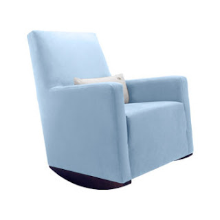 r by monte - (mama needs cushioning for those long nursing nights - no more rock hard rockers on my bum!) on F&F, my absolute favorite, most rocking online baby emporium, run by a super-cool creative mama named Summer.
 r by monte - (mama needs cushioning for those long nursing nights - no more rock hard rockers on my bum!) on F&F, my absolute favorite, most rocking online baby emporium, run by a super-cool creative mama named Summer.
That and Natura paint by Benjamin Moore - what I think (not 100% sure) but I think is the best no-VOC paint on the market. I'm doing a test case...what I like is that the colorant process - adding the color to the white base does not add VOC's and you get to choose from the original BM catalogue - you don't have to limit yourself to fewer colors for those of us who love to know ALL the options - and you don't have to shlep another chip wheel. How great is that?
Friday, June 12, 2009
Designers-turned-parents rock my world
Especially when said designers continue to design fabulous things for babies and kids, without compromising of what's important to eco-conscious parents - while certainly answering the needs of children in a playful, spirited way. I just wrote a piece for Dwell on Design about some of my favorite mommy+daddy designer stories....it looks like I'll be shopping for their wares soon enough, as the stork is expected again in December in our house!
Tuesday, March 31, 2009
RECESSION RENOVATIONS 1st EDITION

It's time to get real people. If I had a dime for every client that has told me in the past three months that they had less money to spend on their home than originally anticipated, I'd be a rich lady. Good news for me - lots of clients - good news for me - they have less money to spend. Why is it good news for me? Because I can finally unleash my inner cheap bastard without shame. I am the frugalest fanny you know. Despite being given the beautiful opportunity to work in the world of television and live within spitting distance of the most expensive city on the planet, I am super cheap. But it's not like cheap for cheap's sake. It's the why-pay-retail attitude. But it's more like this - why pay more, when what I really want is a creative and dynamic space that is personal and beautiful and one that I am personally taking part in buildling? This series, entitled recession renovations, is going to feature and focus on just that - creating personal, beautiful, dynamic spaces that are recession-ready. The ideas are not just choosing a cheaper way to do the same old thing - they are about doing something new and innovative and fabulous, on the cheap. Yay. I've had this bottled up way too long.
Remember stickers in the sixth grade? First object of recession-renovation obsession: SmartTiles. These babies are the kind of tromp d'oeil of your dreams - tricks the eye in a clean, streamlined way, without the fussy faux finishing b.s. They are made of vinyl, but, no kidding, you'd swear they were made of glass. (see photos above)
They mimic the feel and texture and look of porcelain or glass tile, but they are a self-sticking vinyl applique for your walls. This your kitchen bling on a budget. This is the backsplash that got slashed because you decided you were $2000 short. This is the answer to making your bathroom creative and personal. Tile work, as you might now, is incredible labor intensive - when done properly. Sure, it's a DIY for some, but it shouldn't be attempted unless you have an attention to detail, can work quickly and neatly, and you don't mind making mistakes and living with it - as in, living with a mistake in concrete - for the foreseeable future. SmartTiles sort of let you have the look, feel and function of tile without the tile contractor. Have him do something else. This you can do if you can use scissors and a ruler. They come in a splendid array of colors and textures - mostly modern - and they are available at HomeDepot.com - partial catalogue. This is a fabby Canadien company from Montreal. They swear by the durability and lasting function of these tiles which work well in wet spaces like kitchens and bathrooms. So while they are not cheap materials, they are a project where you only pay for materials - no labor, saving lots of dough in the process.
Subscribe to:
Posts (Atom)